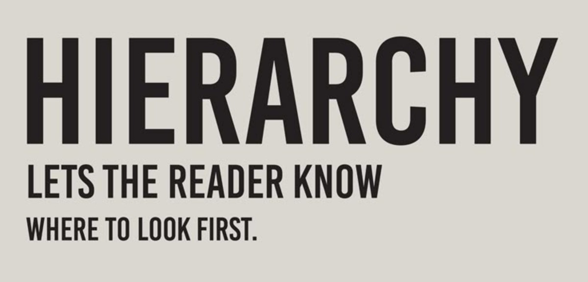
O ierarhie vizuală puternică ajută privitorul să înțeleagă ceea ce vede fără confuzie. Artiștii stabilesc ierarhia prin ajustarea scalei, culorii, plasamentului, contrastului și spațierii. Când aceste instrumente sunt folosite cu gândire, compoziții se simt organizate și ușor de interpretat, indiferent cât de complex este conținutul.
Ierarhia nu înseamnă ordine rigidă sau o singură modalitate de a privi. Permite mișcare și ritm, oferind în același timp indicii subtile care ghidează percepția. Un titlu gras sau un obiect strălucitor atrage atenția în primul rând, în timp ce detaliile din jur susțin focalizarea. Artiștii folosesc, de asemenea, spațiul negativ pentru a da elementelor cheie spațiu pentru a respira, permițând compoziției să se simtă deschisă și accesibilă, mai degrabă decât copleșitoare.
În designul digital, ierarhia este esențială pentru experiența utilizatorului. Butoanele, meniurile și apelurile la acțiune trebuie să se evidențieze fără a perturba aspectul general. În ilustrație, personajul principal ar putea fi evidențiat cu culoare și contrast, în timp ce elementele secundare sunt simplificate pentru a evita distragerea. Aceste strategii fac ca o compoziție să se simtă fluidă, intenționată și emoțional rezonantă.
Cum se realizează
Ierarhia vizuală este construită prin combinația de tehnici strategice care controlează încotro merge privirea și în ce ordine.
Scala și dimensiunea sunt unele dintre cele mai eficace instrumente. Elementele mai mari atrag mai multă atenție, deci plasarea subiectului dvs. cel mai important într-un spațiu mai mare sau desenarea acestuia la o scară mai mare îi oferă imediat prominență.
Contrastul și culoarea ghidează, de asemenea, percepția. Culorile luminoase, contrastul înalt sau texturile îndrăzneți atrag privirea, în timp ce tonurile atenuate se estompează în fundal. Artiștii folosesc adesea lumina și umbra pentru a evidenția zonele focale și a crea adâncime vizuală.
Plasamentul și alinierea au impact asupra fluxului. Obiectele poziționate mai sus într-o compoziție, sau mai aproape de centru sau colțuri, se evidențiază în mod natural. Privirea unui spectator este atrasă către aceste locuri în primul rând, mai ales când sunt combinate cu elemente direcționale precum linii, gesturi sau privire.
Spațierea și proximitatea sunt la fel de importante. Gruparea elementelor corelate împreună arată că aparțin unei unități, în timp ce izolarea unui obiect îi conferă o importanță adăugată. În mise en page digitale, marginile și spațierea consecvente creează un ritm care susține navigarea.
Când toate aceste instrumente sunt combinate cu intenție, ierarhia devine o parte naturală a operei de artă—simțită chiar înainte de a fi observată în mod conștient.
Greșeli frecvente
Una dintre cele mai frecvente greșeli este a face totul vizual egal. Dacă toate elementele sunt de aceeași dimensiune, culoare sau intensitate, nimic nu se evidențiază, iar privitorul nu știe încotro să se uite. Acest lucru se întâmplă adesea în lucrul timpuriu de design, unde echilibrul este confundat cu asemănarea.
O altă greșeală este folosirea excesivă a contrastului în prea multe zone. Când totul este îndrăzneț sau de înalt contrast, privirea sări în jur fără direcție. Punctele focale puternice își pierd puterea dacă sunt în competiție cu prea multe alte elemente zgomotoase.
Spațierea proastă poate deteriora, de asemenea, ierarhia. Când elementele sunt strânse împreună sau aliniate inconsecvent, aspectul se simte dezorganizat, iar ordinea vizuală devine neclară. Acest lucru este deosebit de problematic în interfețele digitale, unde utilizatorii se așteaptă la navigare clară și intuitivă.
În sfârșit, nefolosirea eficientă a spațiului negativ poate aplati o compoziție. Fără zone unde oul să se odihnească, chiar și un punct focal bine proiectat poate deveni pierdut în aglomerație vizuală.
Concepte Artistice
Plasarea elementelor primare
La baza ierarhiei vizuale se află plasarea elementelor primare—acelea care au cea mai mare pondere în ghidarea atenției spectatorului. Acestea pot fi personajul principal într-o ilustrație, titlul într-o mișcare, sau un buton de apel la acțiune pe un site. Poziția, dimensiunea și proximitatea lor față de centru sau intersecțiile grilei de compoziție determină cât de repede și clar sunt observate.
În designul editorial, un titlu îndrăzneț aliniat la treimea superioară a paginii semnalează imediat de unde să începi citirea. În ilustrație, plasarea subiectului principal în afara centrului, dar de-a lungul unei căi vizuale, ghidează ochiul natural în scenă, păstrând în același timp un sens de echilibru și ritm.
Detalii de suport
Elementele de sprijin ajută să încadreze, să consolideze sau să extinzi mesajul fără a concura pentru atenție. Acestea includ text secundar, personaje de fundal, texturi subtile sau pictograme suplimentare. Rolul lor este să îmbogățească experiența spectatorului odată ce punctul focal primar este stabilit.
În designul de caractere, accesoriile de fundal și gradienții de culoare ajută să spună povestea, dar rămân vizual discreți. În designul digital, subtextul, legăturile de navigare sau elementele decorative completează punctul focal, păstrând în același timp o ierarhie curată și ușor de navigat.
Contrast
Contrastul ajută la separarea diferitelor niveluri de importanță în cadrul unei compoziții. Poate fi vizual (deschis vs. închis, îndrăzneț vs. moale), spațial (aproape vs. depărtat) sau conceptual (literal vs. simbolic). Contrastul eficace permite elementelor primare să iasă în față, în timp ce elementele secundare se retrag ușor în fundal.
De exemplu, un obiect colorat strident pe o paletă ușoară captează atenția instantaneu. În designul interfețelor, un buton cu contrast ridicat asigură interacțiune imediată, în timp ce elementele de sprijin mai ușoare se estompează în design, menținând focusul clar.
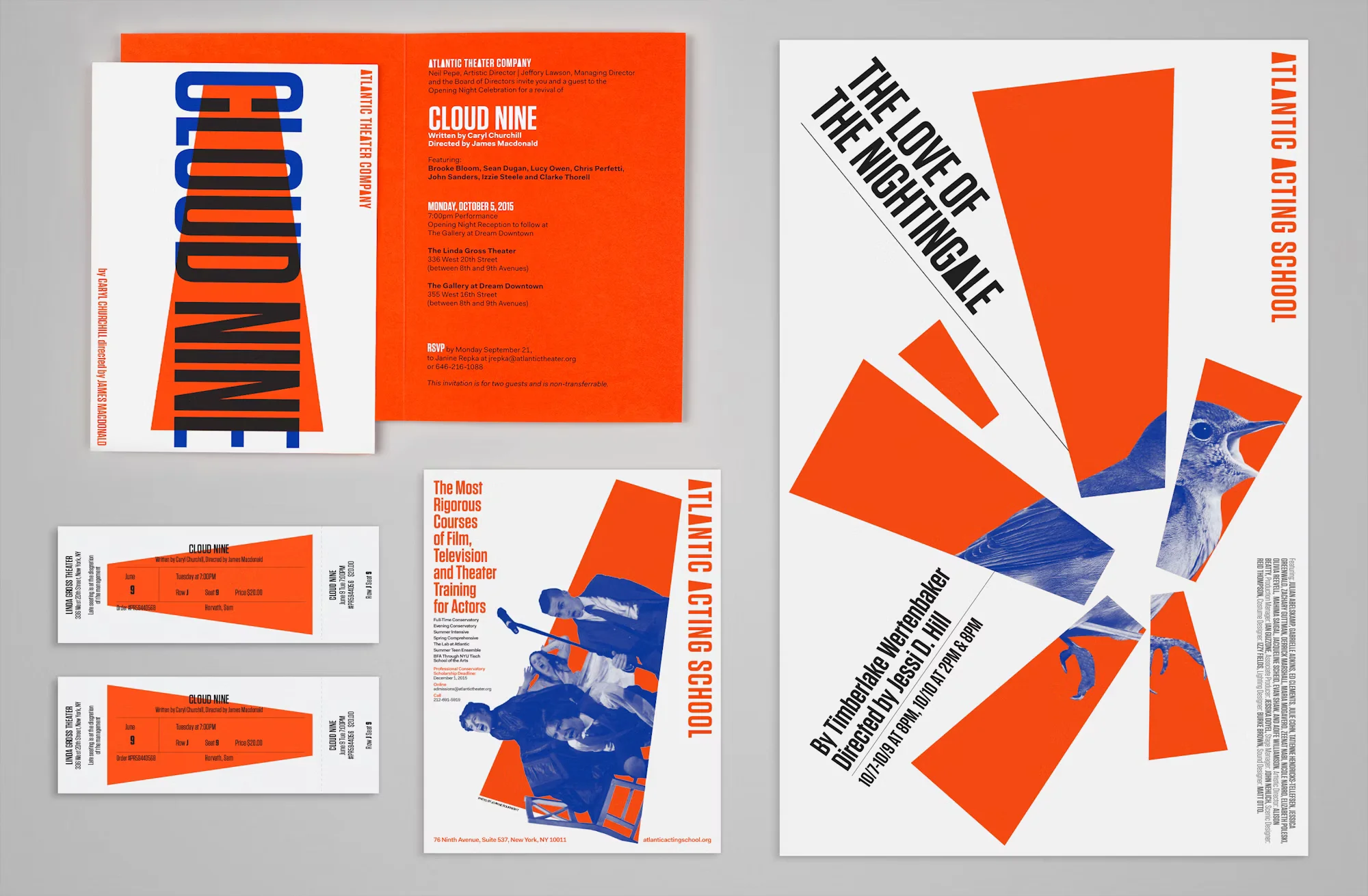
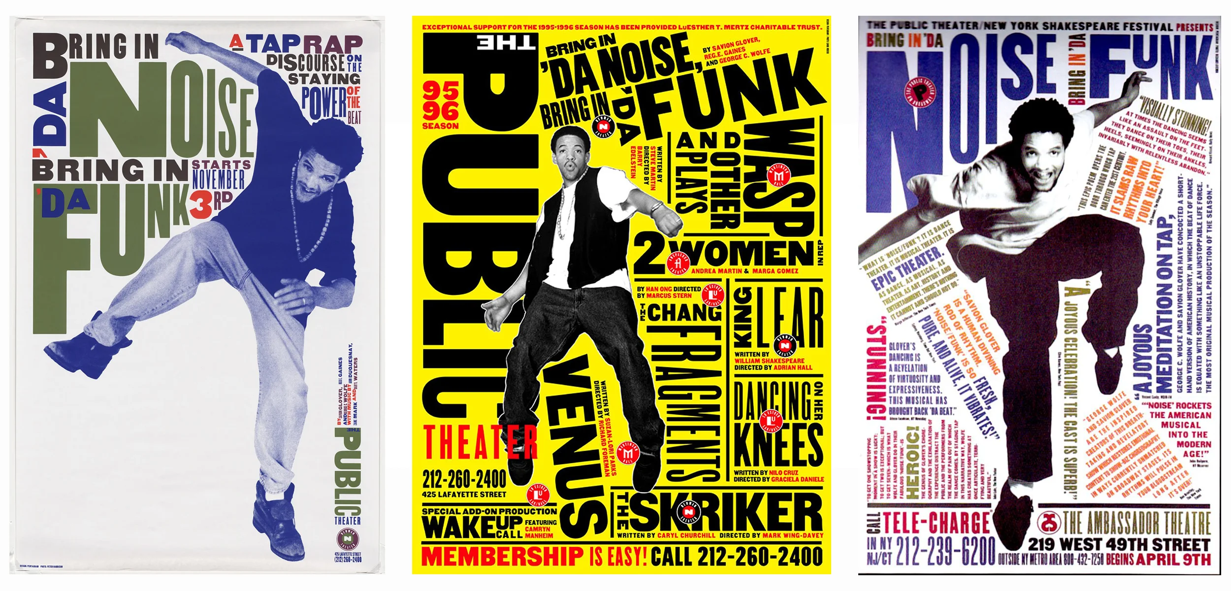
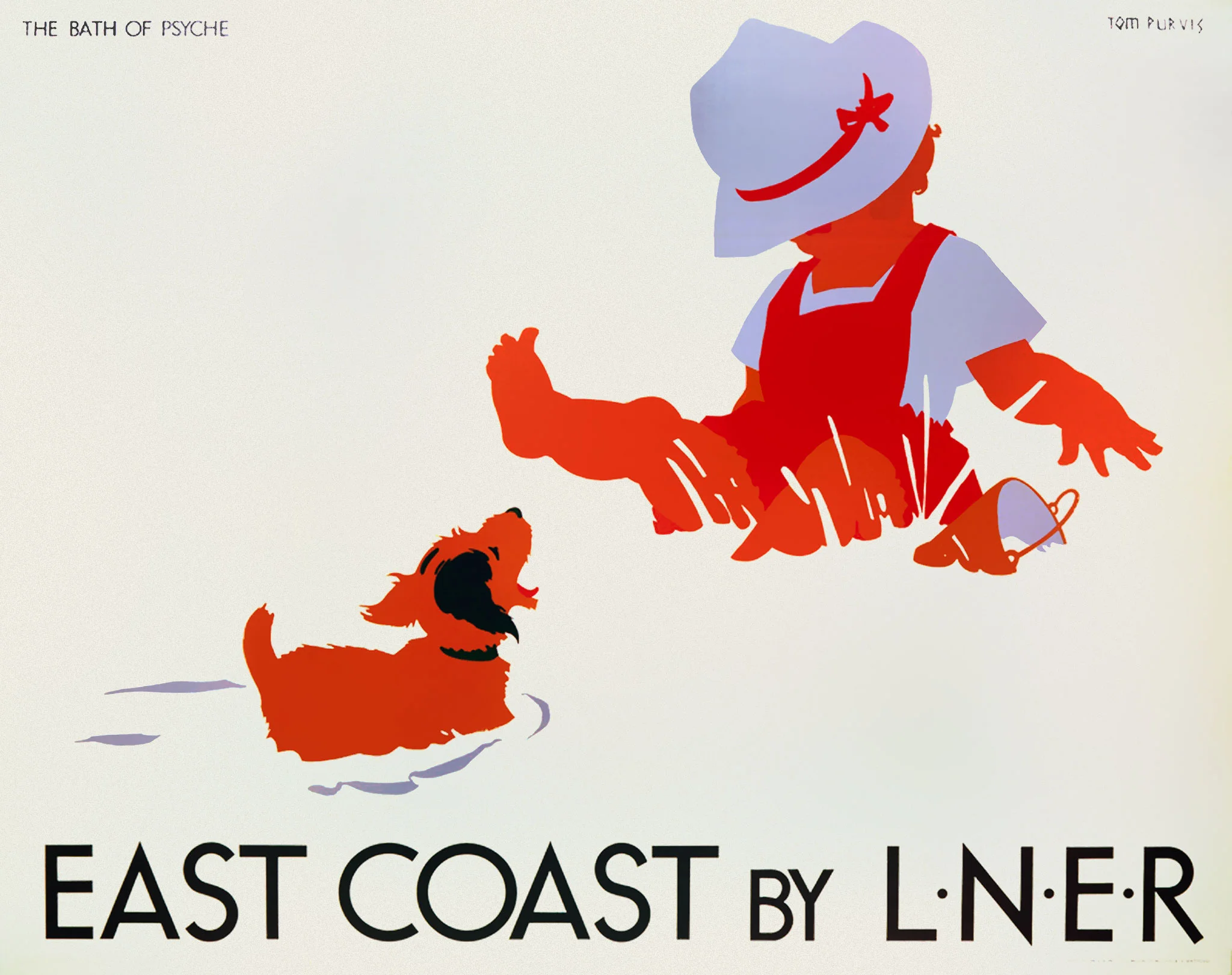
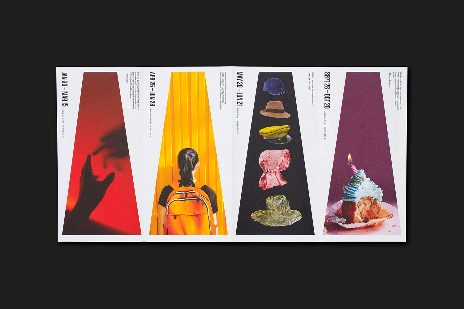
Exemplu vizual

Cum ajută ierarhia vizuală în comunicare?
Ierarhia vizuală asigură că informația este prezentată într-o ordine clară și logică. Ea ghidează atenția observatorului, ajutându-l să absorbeză mai întâi punctele cele mai importante. Aceasta îmbunătățește atât lizibilitatea, cât și conectarea emoțională cu lucrarea de artă sau designul.
Care sunt cele mai bune modalități de a construi ierarhia vizuală în ilustrație sau design digital?
Cele mai eficiente instrumente includ dimensiunea, contrastul de culoare, distanțarea, alinierea și stratificarea. Utilizarea unei grile coerente, prioritizarea punctelor focale și crearea spațiului de respirație prin spațiul negativ ajută la stabilirea unei ordini clare. Ierarhia este, de asemenea, modelată de alegeri tipografice și ritm vizual.
Poate ierarhia vizuală funcționa fără text?
Da. Ierarhia vizuală nu depinde de text—este despre modul în care elementele vizuale se raportează între ele. Prin dimensiune, contrast, plasare și distanțare, artiștii pot ghida ochiul și crea sens chiar și în compoziții complet abstracte sau fără text.