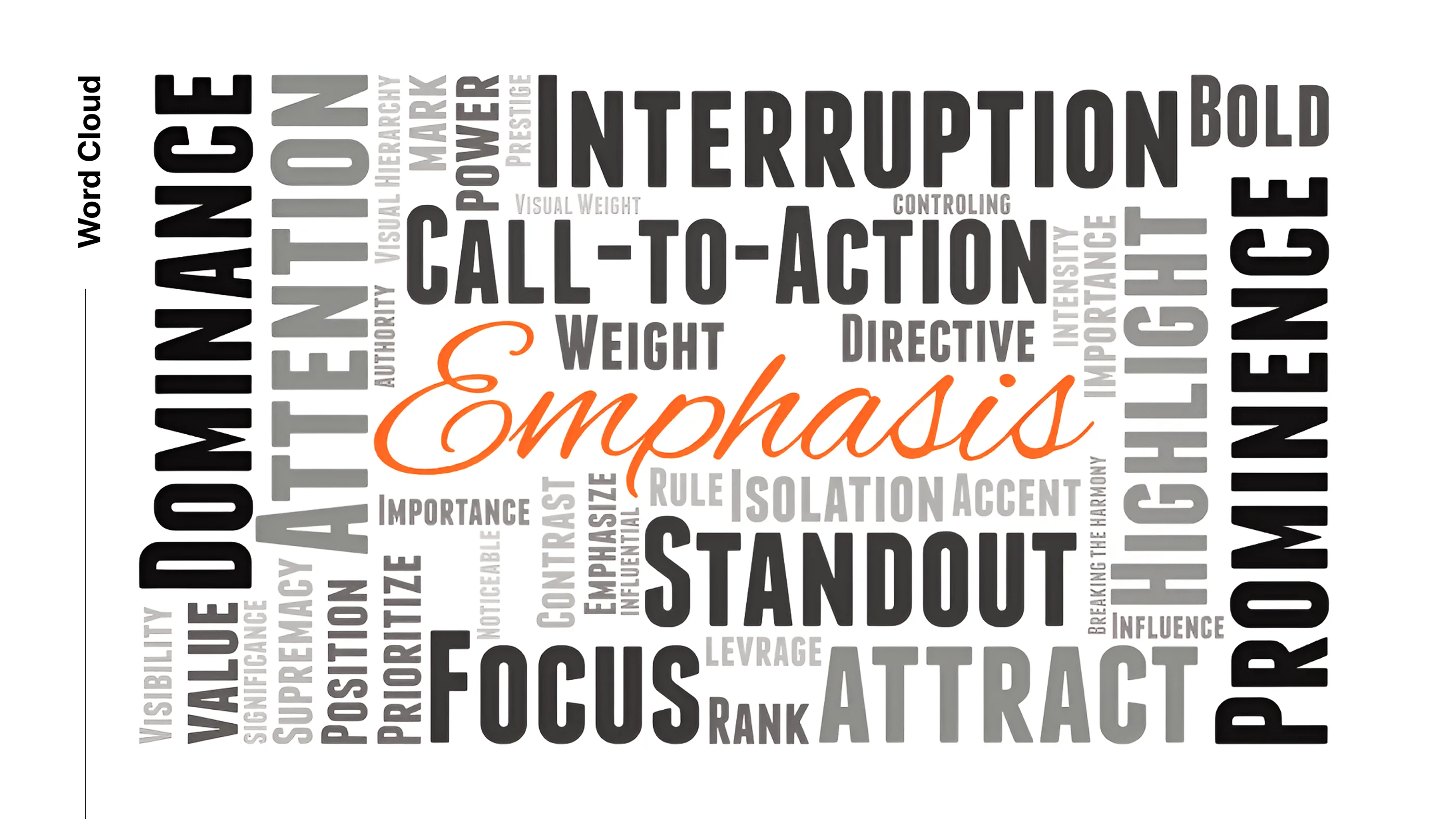
Emphasis helps organize visual information. It identifies what matters most and ensures that the viewer notices it. This might be the main character in an illustration, a product in an advertisement, or a call-to-action in a website layout.
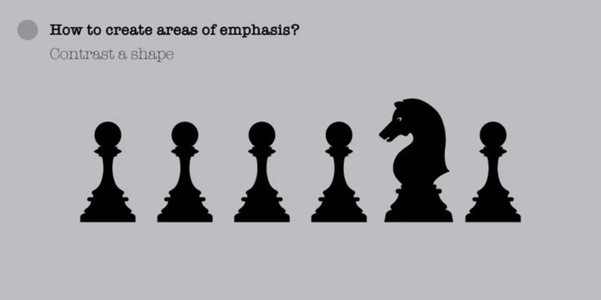
Strong emphasis is usually achieved through contrast—whether in size, color, texture, or value. A bright object in a dark scene, a detailed face among blurred surroundings, or a bold font against a minimal background—all create emphasis.
But emphasis isn’t just about what stands out. It’s also about how everything else supports it. A good composition balances emphasis with subtlety. Supporting elements are toned down so the focal point can shine. Emphasis is most powerful when it’s clear, but not overpowering.
How to Achieve It
Emphasis can be created using a variety of techniques, all of which rely on contrast and visual priority.
Color and contrast are among the most effective. A vivid color placed in a neutral or monochrome setting grabs attention instantly. High contrast—light against dark or sharp against soft—pulls focus toward the emphasized element.
Size and scale are also important. A large shape surrounded by smaller ones will naturally dominate. Likewise, a single oversized word or figure in a layout or scene immediately becomes the visual anchor.
Placement plays a key role. Objects placed near the center, or along key grid intersections like those in the rule of thirds, are more likely to be noticed. Directional lines or gaze can also point to the area of emphasis, subtly leading the viewer to it.
Isolation enhances emphasis by separating the focal point from other elements. When something is placed apart, it gains visual weight simply by being alone.
These techniques, when used intentionally and in harmony, ensure that emphasis adds clarity, structure, and energy to an artwork.
Common Mistakes
A common mistake is trying to emphasize too many things at once. When everything is highlighted—through color, detail, or size—nothing stands out. The viewer becomes overwhelmed and the purpose of the composition is lost.
Another issue is lack of contrast. If the focal point doesn’t differ enough from its surroundings, it won’t attract attention. This happens when colors are too similar, or textures and values blend together.
Some compositions suffer from poor placement. Even with strong visual elements, placing the point of emphasis too close to the edge or away from the natural flow of the eye can make it easy to miss.
Lastly, over-emphasizing can be just as problematic. If the focal point is too bold—oversized, too bright, or too detailed—it may overpower the rest of the composition and feel disconnected or forced. Emphasis must be balanced within the whole.
Artistic concepts
Lost in detail
When emphasis isn’t clearly established, the viewer can easily get lost in detail. An artwork that features the same level of visual intensity throughout—sharp textures, complex shapes, or bold colors everywhere—leaves the eye wandering without purpose. Without a clear focal point, the viewer struggles to identify what matters most.
This often occurs in early-stage digital illustrations or dense visual layouts, where everything is rendered with equal care but no element leads the composition. Effective emphasis simplifies the surrounding environment to give space and clarity to the focal area. Knowing what to leave out is just as important as knowing what to highlight.
Impact
Impact is the immediate visual or emotional response created by emphasis. It’s what makes the viewer pause, lean in, or feel something. A strong impact doesn’t always mean dramatic contrast—it can also be quiet and subtle, as long as it stands out against its context.
For example, in poster design, a single large word can carry impact when placed with intention. In narrative illustration, a close-up on a character’s expression at a key moment delivers emotional weight. Emphasis creates impact when it aligns with the story, mood, or message of the piece.
Detail and sharpness
Detail and sharpness are frequently used to draw the eye. In digital art, the most emphasized areas are often where the artist spends the most time refining edges, adding texture, and adjusting lighting. This sharpness contrasts with softer or more abstract surroundings, naturally attracting attention.
For instance, in concept art, the focal subject—like a character or vehicle—will be highly rendered, while background elements are more gestural. In branding, logos or taglines may be given crisp edges and bold outlines to increase legibility and focus. Mastering where and how to use detail makes emphasis more powerful and compositionally balanced.
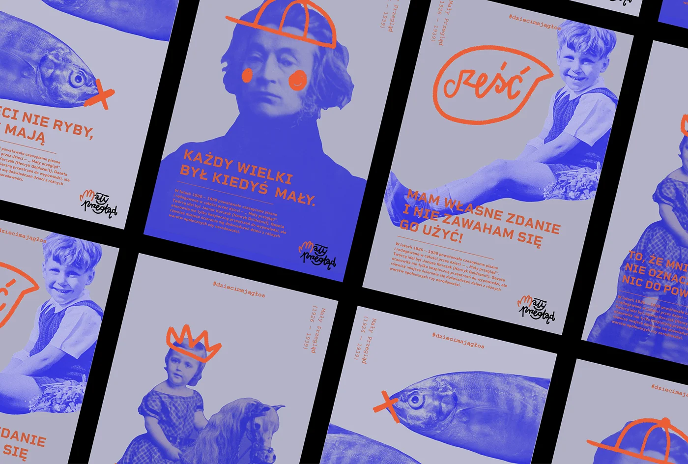
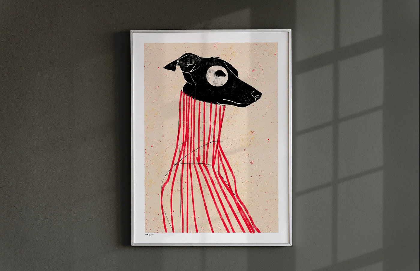
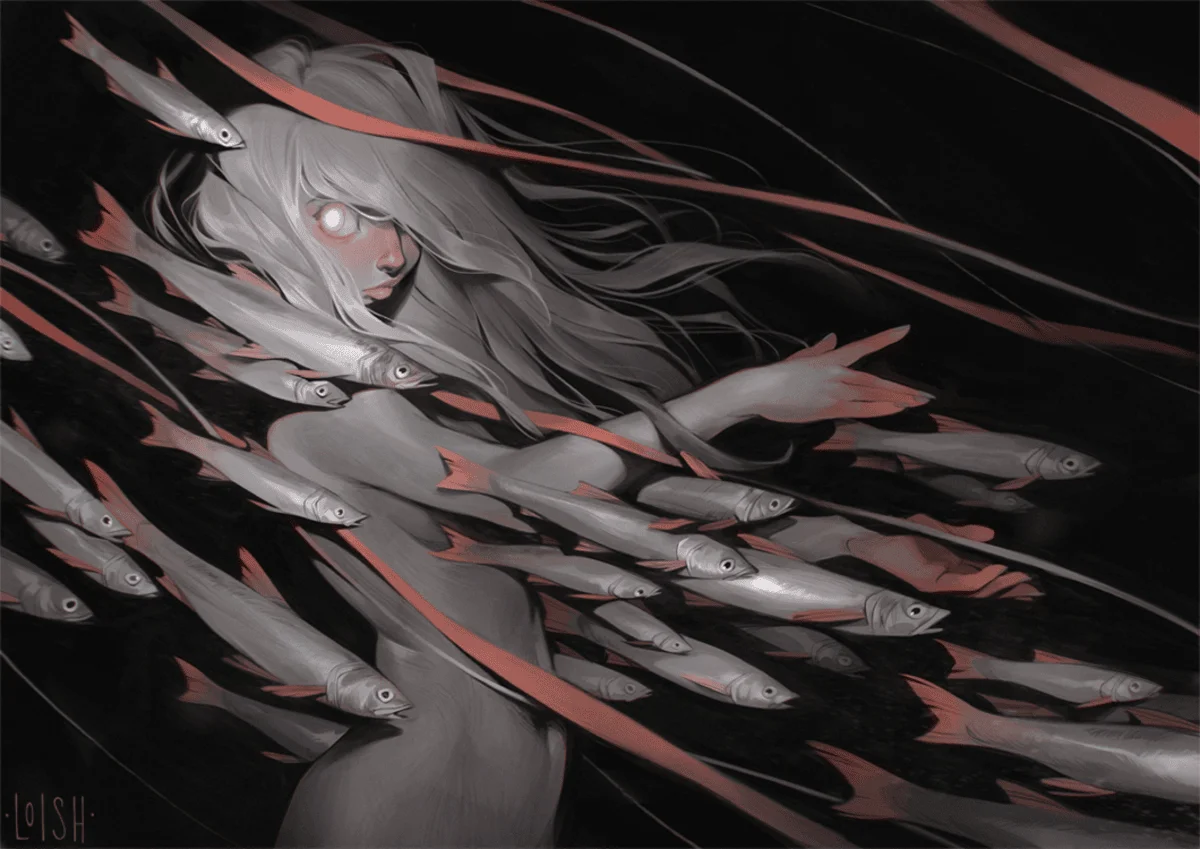
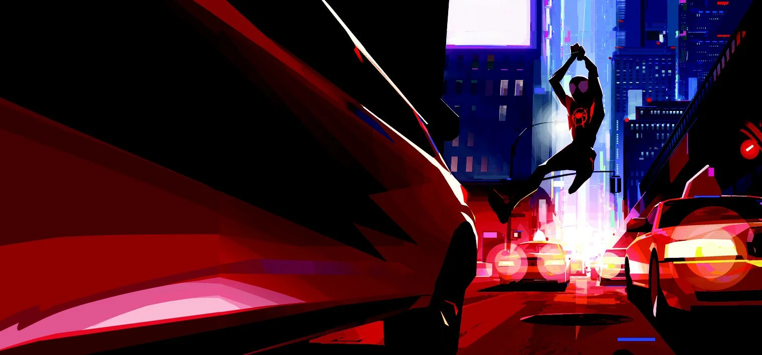
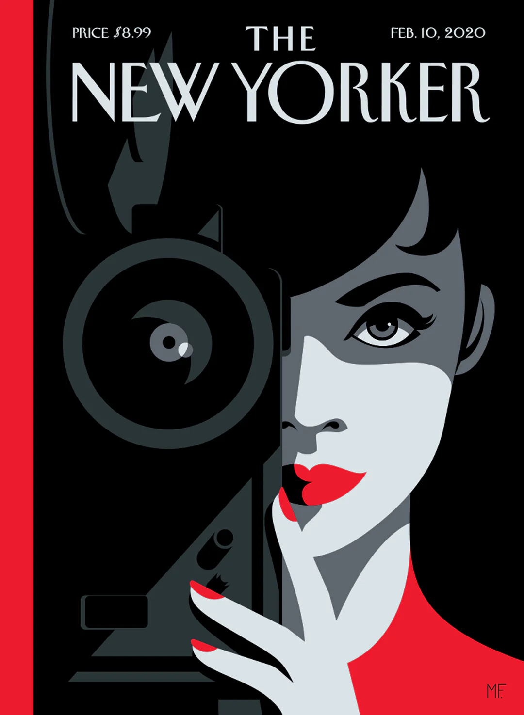
Visual Examples
.webp)
Why is emphasis important in art?
Emphasis helps organize a composition and guide the viewer’s attention. It defines the focal point, strengthens communication, and ensures the viewer connects with the most meaningful part of the piece.
What tools are best for creating emphasis?
The most effective tools include contrast, size, placement, isolation, and directional lines. These elements work together to highlight the subject while maintaining overall harmony.
Can emphasis be subtle?
Absolutely. Emphasis doesn’t always need to be bold. A subtle shift in color, texture, or sharpness can gently guide the viewer without disrupting the mood or balance of the artwork. Subtle emphasis often creates more curiosity and encourages closer inspection.